The Art of Design: Crafting a Visually Stunning Shopify Store
Uncover the secrets to creating visually stunning Shopify stores that captivate audiences and leave a lasting impression.
In the crowded e-commerce landscape, visual design is your secret weapon. A well-designed Shopify store doesn't just look good—it builds trust, guides users, and ultimately drives conversions. This guide will walk you through the principles and practices of creating a visually stunning online store.
Design Psychology: More Than Aesthetics
Great design is rooted in psychology. Understanding how visual elements influence user behavior is the foundation of effective e-commerce design.
Core Design Principles
- Visual Hierarchy: Guide users' eyes to the most important elements
- White Space: Give content room to breathe
- Consistency: Maintain uniform styling across all pages
- Contrast: Make important elements stand out
- Balance: Distribute visual weight evenly
Color Psychology in E-commerce
Colors evoke emotions and influence purchasing decisions. Choose your palette strategically:
Color Meanings
- Blue: Trust, professionalism, security (popular for financial and tech products)
- Red: Urgency, excitement, passion (great for clearance sales and CTAs)
- Green: Nature, health, growth (perfect for organic and eco-friendly products)
- Black: Luxury, sophistication, premium (ideal for high-end brands)
- Orange: Friendly, energetic, affordable (works well for impulse purchases)
Practical Tips
- Limit your palette to 2-3 primary colors
- Use a 60-30-10 rule (60% dominant, 30% secondary, 10% accent)
- Ensure sufficient contrast for accessibility (WCAG AA standards)
- Test colors with your target audience
Typography: The Unsung Hero
Typography affects readability, brand perception, and user experience. Here's how to get it right:
Font Selection
- Headlines: Bold, attention-grabbing fonts (but keep them readable)
- Body text: Clean, easy-to-read sans-serif fonts
- Accent: Decorative fonts sparingly for special emphasis
- Font pairing: Limit to 2-3 fonts maximum
Readability Guidelines
- Minimum font size: 16px for body text
- Line height: 1.5-1.6 for optimal readability
- Line length: 50-75 characters per line
- Adequate contrast between text and background
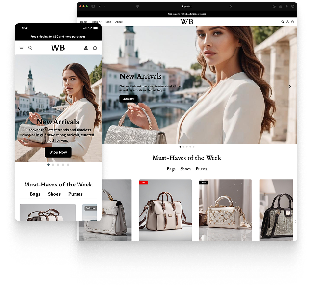
Imagery Best Practices
High-quality images are non-negotiable for e-commerce success. They're often the deciding factor in purchase decisions.
Product Photography
- Professional quality: Invest in good product photography
- Multiple angles: Show products from all sides
- Lifestyle shots: Help customers envision products in use
- Consistent styling: Maintain uniform backgrounds and lighting
- Zoom functionality: Allow users to see details
Image Optimization
- Use WebP format for better compression
- Implement lazy loading
- Optimize alt text for SEO and accessibility
- Use responsive images for different screen sizes
Layout and Grid Systems
A well-structured layout makes content scannable and navigation intuitive.
Layout Best Practices
- F-pattern scanning: Place important content along the F-pattern
- Grid-based layouts: Use columns for visual organization
- Above the fold: Put key information and CTAs where users see them first
- Responsive design: Ensure layouts work on all devices
Crafting Compelling Product Pages
Product pages are where conversions happen. Make them exceptional:
Essential Elements
- Hero image: Large, high-quality product image
- Clear product title: Descriptive and keyword-optimized
- Price prominence: Make pricing clear and unambiguous
- Trust signals: Reviews, ratings, badges
- Detailed descriptions: Benefits-focused copy
- Strong CTAs: Prominent "Add to Cart" buttons
Navigation and User Flow
Intuitive navigation keeps users engaged and reduces friction.
Navigation Principles
- Keep main menu simple (5-7 items max)
- Use descriptive labels
- Implement breadcrumbs for deep sites
- Add search functionality
- Create clear paths to checkout
Mobile-First Design
With mobile traffic dominating, design for mobile first, then scale up.
Mobile Design Essentials
- Touch-friendly buttons (minimum 44x44px)
- Simplified navigation (hamburger menus)
- Fast loading times
- Easy-to-read text without zooming
- Streamlined checkout process
Accessibility: Design for Everyone
Inclusive design isn't just ethical—it expands your market and improves SEO.
Accessibility Checklist
- ✓ Sufficient color contrast
- ✓ Alt text for all images
- ✓ Keyboard navigation support
- ✓ Screen reader compatibility
- ✓ Clear focus states
- ✓ Descriptive link text
Testing and Iteration
Design is never "done." Continuously test and refine:
- A/B testing: Test different design variations
- Heatmaps: Understand how users interact with your pages
- User feedback: Ask customers for their input
- Analytics: Track metrics like bounce rate and time on page
Conclusion
Creating a visually stunning Shopify store requires balancing aesthetics with functionality, brand expression with user needs, and creativity with data-driven decisions. Remember: the best design is invisible—it guides users seamlessly toward their goals without drawing attention to itself.
Start with these principles, test with real users, and refine based on results. Your visually stunning Shopify store awaits!
Featured theme: Fennec
Fast, responsive, SEO-ready theme built for conversion.
- Online Store 2.0 sections
- Performance-first layout
- Accessible, SEO-ready foundation